Overview
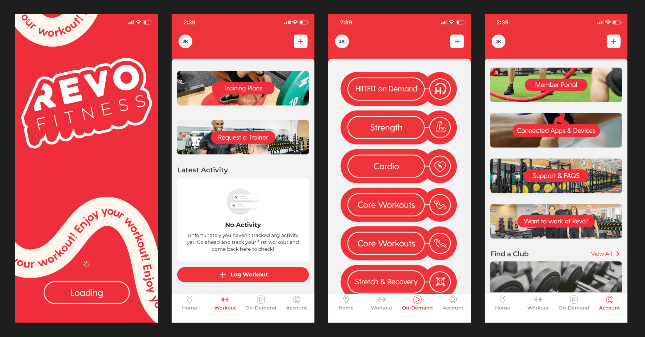
As someone who enjoys going to the gym and staying fit, Revo Fitness is one of the places I enjoy working out. My experience with the mobile app made me curious about how the experience could be improved and how the visual style could better match the brand. At the time, the app experience felt limited and mostly focused on a single-page approach. I wanted to expand the rest of the key pages while keeping the same Revo style and energy. The goal was to improve ease of use, create a stronger design system, and make the app feel more complete for members.
Empathize
I started by approaching five gym members for a small conversation about their experience using the app. The conversations went smoothly because they shared similar concerns about style consistency and how the app separates membership access from non-member information. This helped me understand that the issue was not only visual, but also structural. Members needed a clearer way to understand what belonged to their access level and what information was available to everyone. These insights became the foundation for improving the navigation and content structure.
Define
After understanding the issue, I defined the problem around access levels, content placement, and feature clarity. I needed to decide which features belonged to each membership level and which features should stay open to everyone. For example, general content such as news, shop information, and updates should be easy to access without confusing it with member-only perks. This helped separate the app into clearer sections with a stronger purpose for each page. The design direction became focused on making access easier to understand while keeping the experience consistent.
Ideate
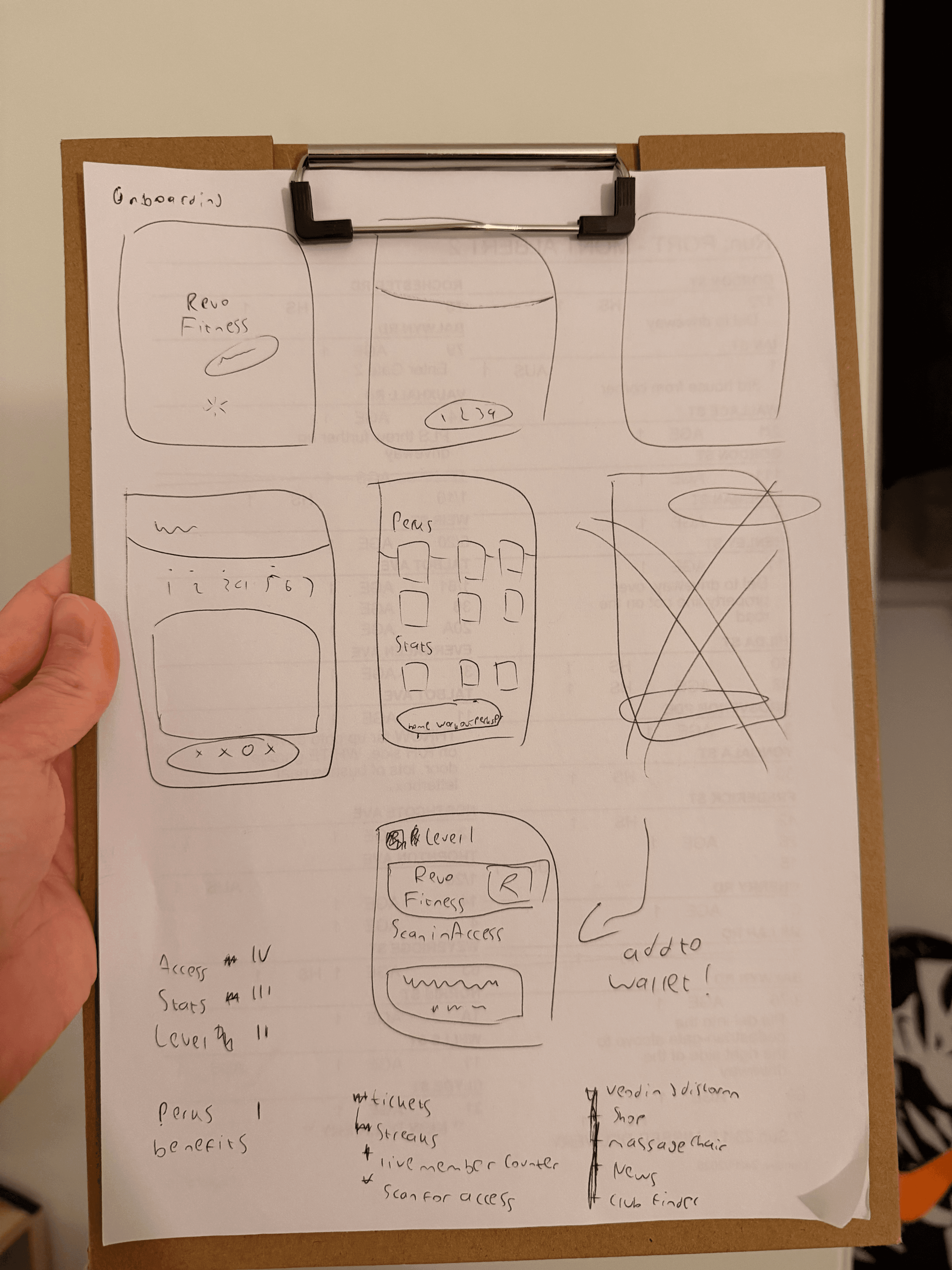
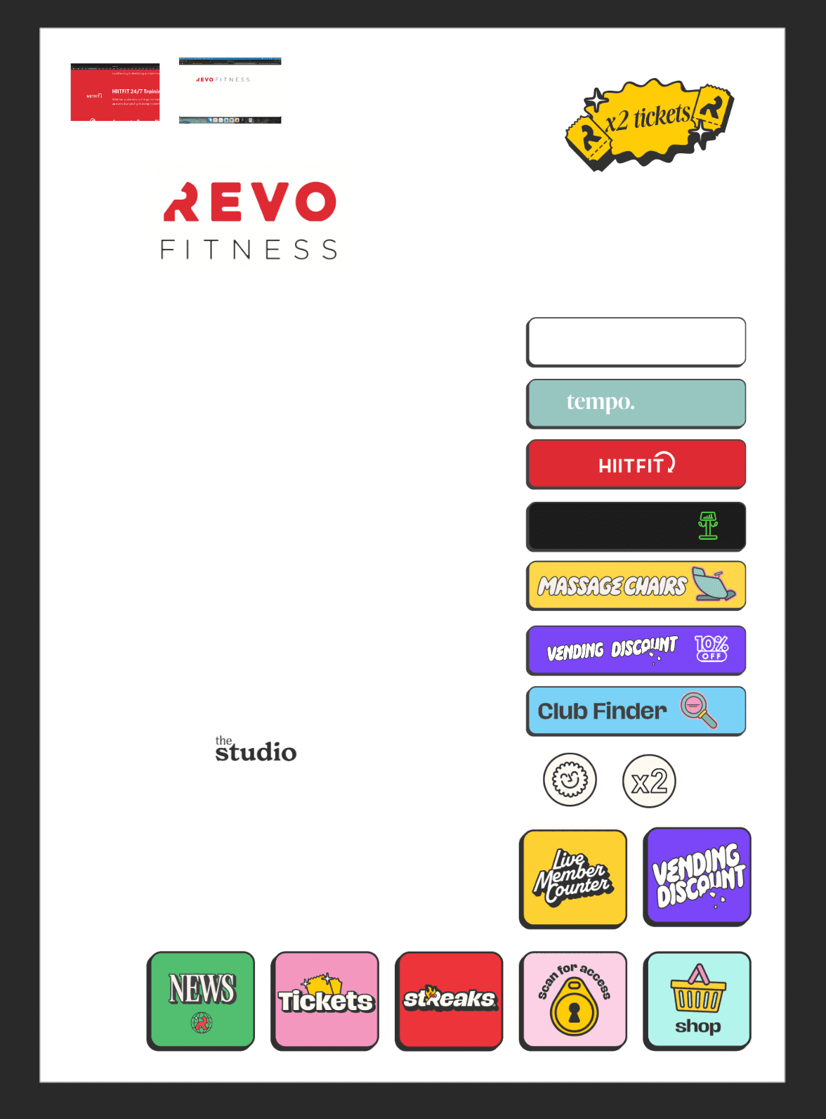
For the design exploration, I used Affinity to organise which parts belonged to each feature group and to adjust the visual direction. I focused on button sizing, spacing, and how much information could fit clearly on screen without forcing unnecessary scrolling. The challenge was making the interface feel complete while still keeping it easy to scan. I explored how the Revo visual style could be carried across new pages without making the app feel crowded. This stage helped me understand which layouts were practical before moving into the full prototype.
Prototype
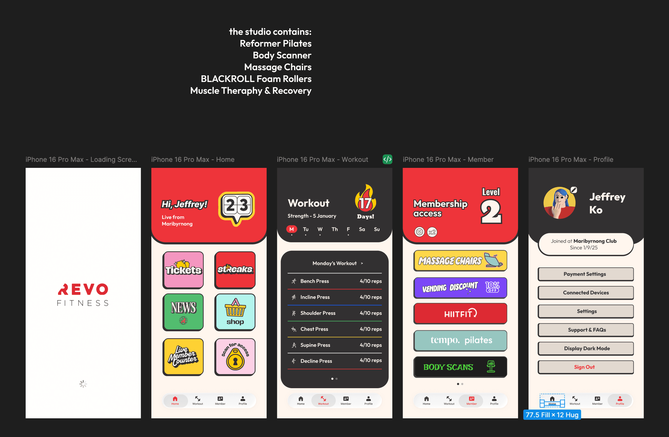
Once I understood the structure, I moved into Figma and created the pages from the loading screen through to the profile experience. For the Home page, I placed features that can be accessed at any level and treated them more as information than exclusive perks. For Workout and Member sections, I focused on where the membership-related benefits should live. This made the app feel more organised and easier to understand from the first screen. The prototype connected each page into a clearer flow so the overall experience felt more complete.
Test
After creating the designs, I showed them to the members while they were resting and asked for their thoughts. The response was supportive, and they felt the new pages were a strong starting point for improving the app experience. They liked that the structure separated information and perks more clearly while still matching the Revo Fitness style. The feedback also suggested that the idea could continue on a deeper scale if more features were developed. This helped confirm that the redesign direction improved clarity, consistency, and the overall approach to using the app.