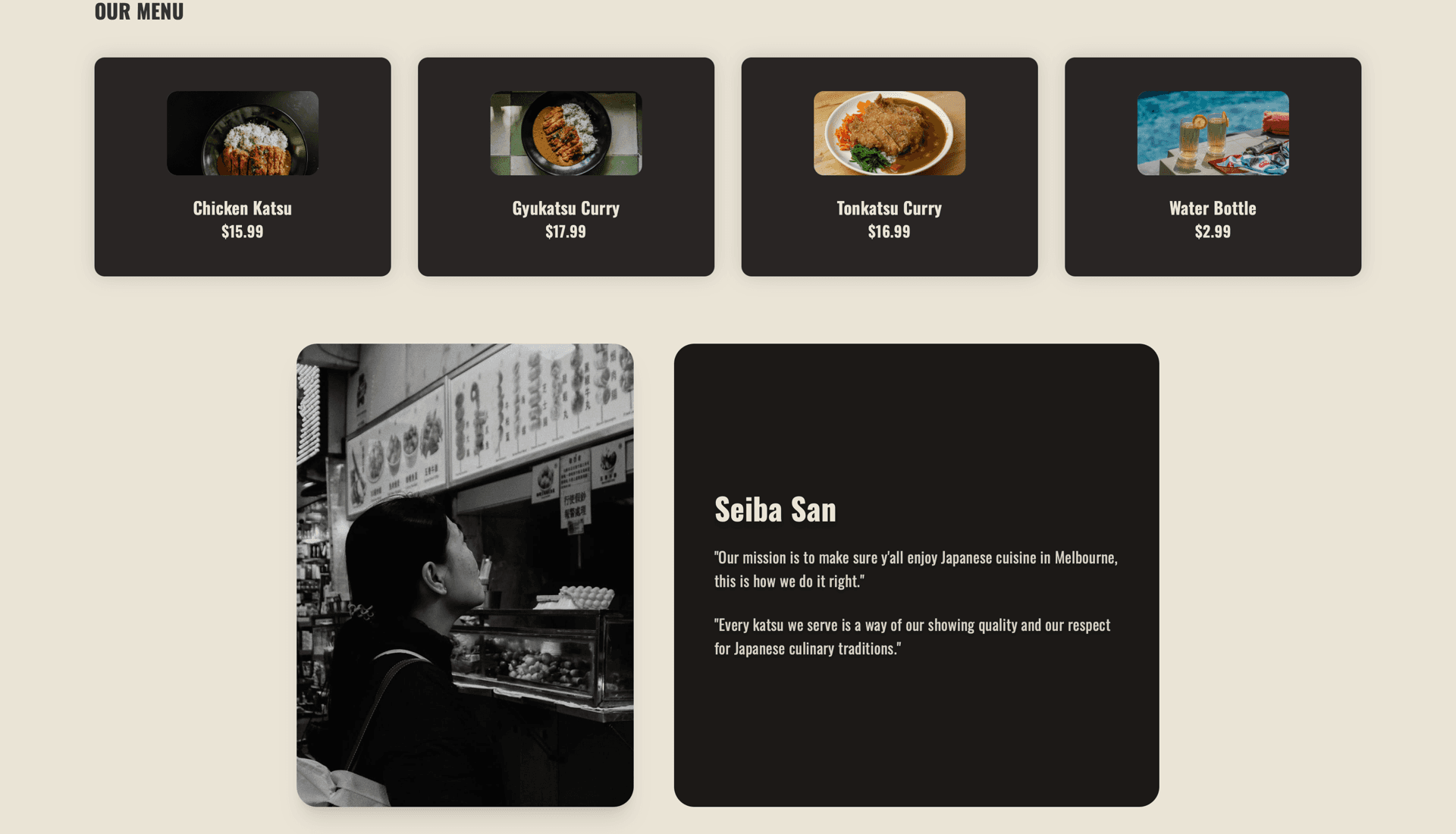
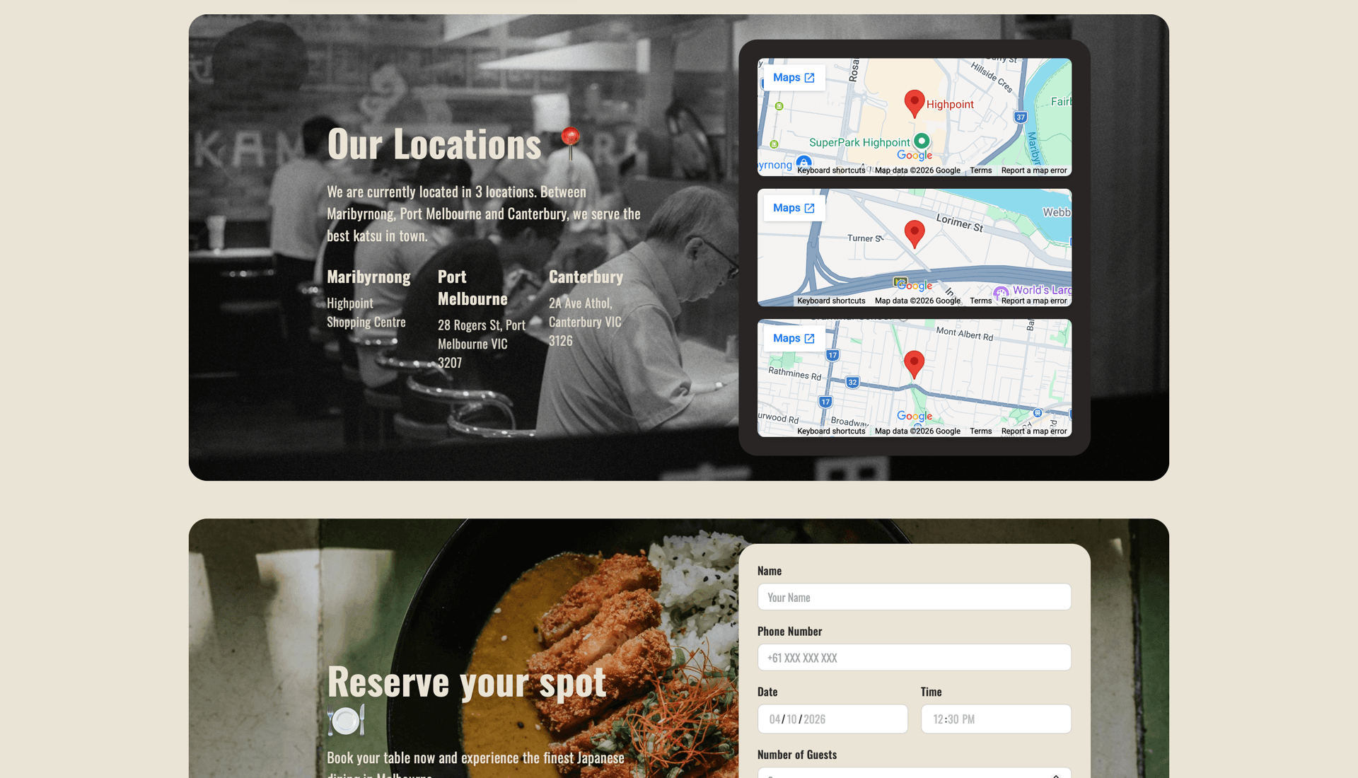
People land on a restaurant site to work out the food, the atmosphere, the location, and how to book — usually in that order, usually fast. The sites I looked at picked one side: attractive but hiding the practical information, or informative with no mood at all. Colour choices between type and background quietly decide whether a place reads premium, calm, or just hard to read.
02
Constraint
Minimal could not mean empty. The site had to carry a Japanese-inspired identity and stay legible, which made contrast between font colour and background a hard requirement rather than a styling preference. Every section still had to leave the next action obvious.
03
Decision
I used fewer elements with more intention — spacing, imagery, and simple navigation doing the work instead of decoration. Booking is never more than one action away, so the path from first impression to reservation has no detour. Type, background, and image placement were tuned together so no section creates visual noise.
04
Outcome
Feedback focused on hierarchy, spacing, and text-on-background contrast, and the design got cleaner in response without losing the practical information. The result reads as a calm introduction to the restaurant that still tells you where to go next.