Project 05
Revo Fitness
Perks and public info split into separate screens.
01
Problem
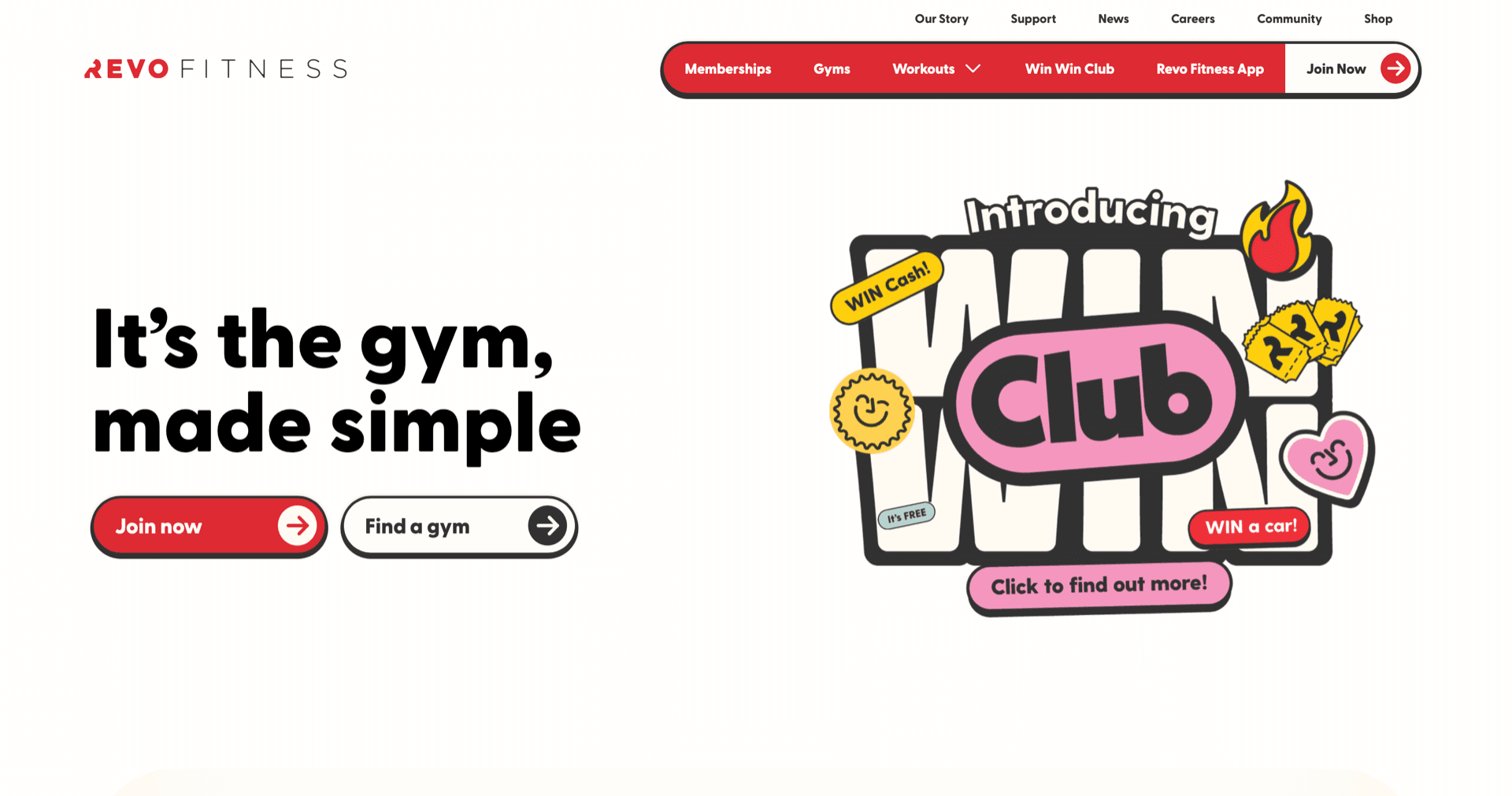
Revo is the gym I actually train at, and the app never matched the energy of the brand. It leaned on a single-page approach, so membership perks and general information — news, shop, updates — sat together with nothing to separate them. I spoke with five members and they raised the same two things: the visual style felt inconsistent, and it was not obvious what their plan actually included.
02
Constraint
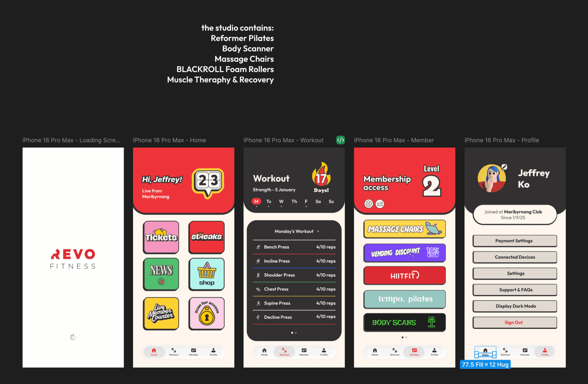
The problem was structural, not only visual. Anything I changed had to keep the Revo look and energy intact while making access levels legible: what belongs to a member, and what is open to everyone. Adding pages could not mean adding scrolling — the app had to feel more complete without feeling more crowded.
03
Decision
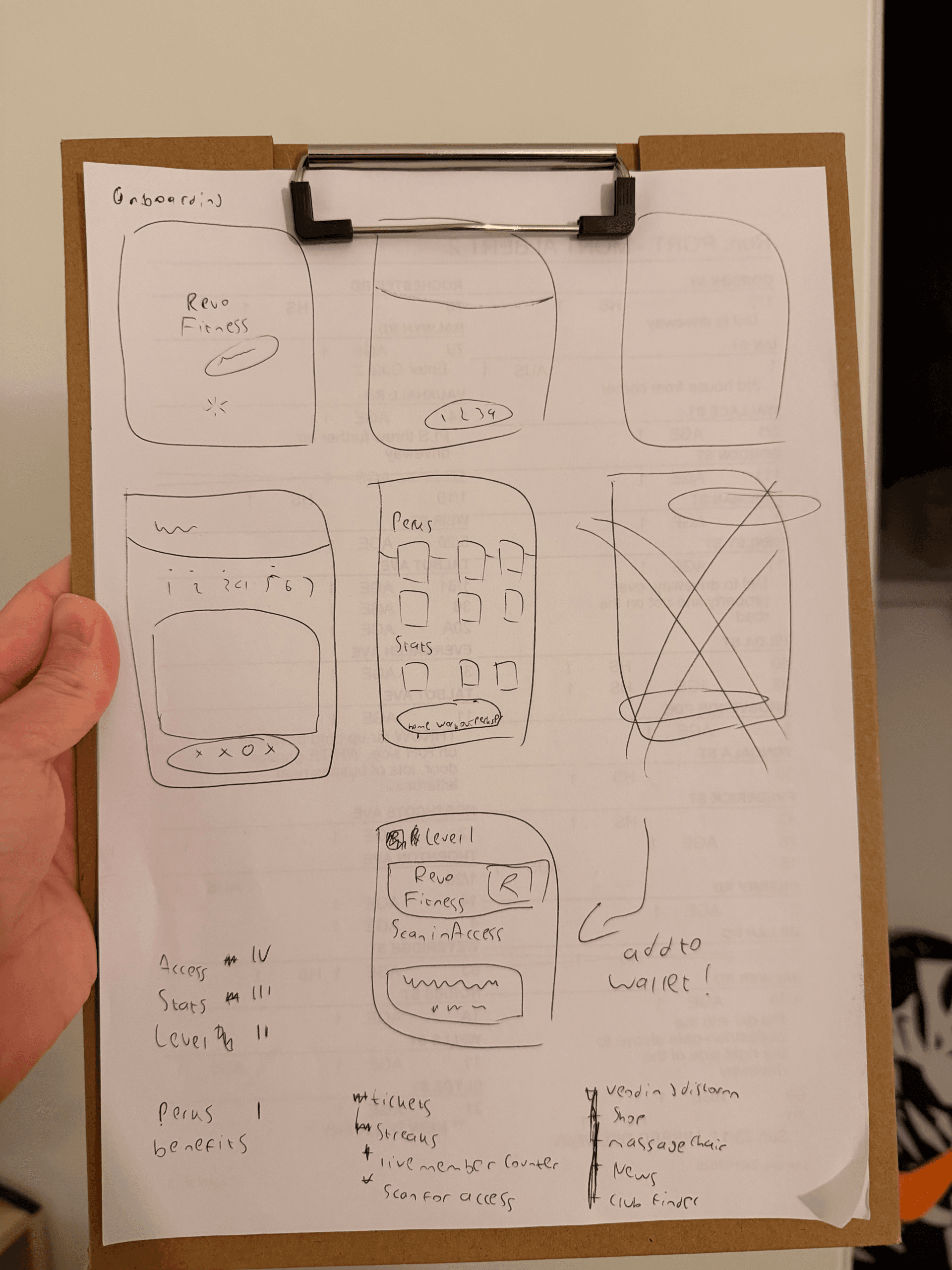
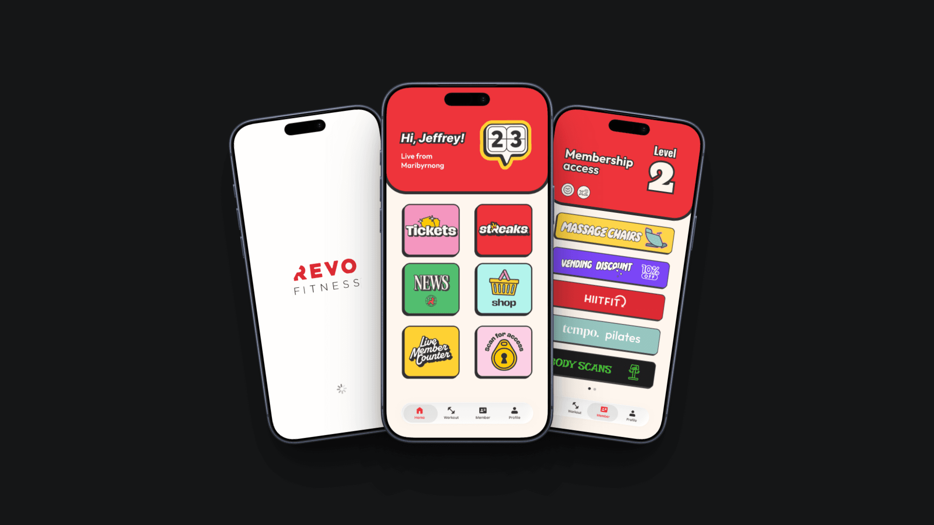
I used Affinity to group features by access level, then built the pages out in Figma from the loading screen through to the profile. Home carries what anyone can reach and treats it as information rather than an exclusive perk. Workout and Member sections hold the plan-specific benefits. Button sizing and spacing were tuned so each screen stays scannable at a glance.
04
Outcome
I took the screens back to the same members between sets. They read the split between information and perks correctly, and said the structure was a stronger starting point than the current app while still looking like Revo. The feedback pointed at depth as the next step — more features per section rather than more sections.